Sunday, May 29, 2011

Self help book: Final 'Sext Book'

Front cover


Back Cover


Contents page: The visual imagery in the contents, such as the white bed, simple black and white couple and rustic brush background, runs throughout the rest of the book. Hope you enjoy!


Page 1: An introduction to what this self-help Sext Book is about.


Page 2: The Missionary Position with a twist.


Page 3: The Yab-Yum Position- for intimacy. It also contains health benefits of sex. 


Page 4: The Yawning Position- has many advantages for men and women that you've never heard before.


Page 5: The Splitting Bamboo Position- for a slow candle-lit night. 

Saturday, May 28, 2011

Self help book: planning and mock-up


For this brief we were told to design a self-help book. A book that has a purpose in helping people improve their lives. I decided to to make a self-help sex book, as i feel that a lot of people have problems in the sexual ares of their lives. I researched as well as used my own knowledge of sex to construct this book. It will have a variety of sexual insights that anyone can benefit from. The book will contain sex positions and how to perform them, tips on how to improve your ex life as well as the health benefits of sex.


Saturday, April 16, 2011

Triplex bag:


Here above show's the final product of my triplex bag being modeled off, as you can see i chose to go ahead with the camera bag as i thought it would look the most chic and sophisticated bag to design with triplex!

Friday, April 15, 2011

Advertising campaign Brief: Final Ads


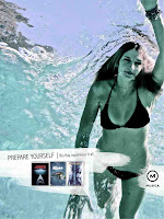
We were extremely happy with the way the ads turned out, as the all had a very similar visual affect and and appeal to them, which in turn brought them together in terms of cohesiveness through out the campaign we chose to do for musica 'Blu-Ray" genre's.

Each ad is made to represent the 'real' feeling that 'Blue-Ray' movies offer when watched. This is portrayed by each ad directly relating to the movings in the ad reinforcing the idea that you feel as if you are a part of the movie when you watch with Blue-Ray as the quality is so good.

Wednesday, April 13, 2011

Advertising campaign Brief: Scamps & mock Ups.


 For the advertisement we decided to go ahead with doing a Musica campaign where we explored the different ways to portray 'Blu-Ray' movies as very high quality by advertising them to be an 'experience' as if you are part of the movie when watching it and therefore have to prepare yourself for the great experience.

Therefore as you can see throughout the scamps i've done, we are trying to get the message across by using ambiguous images and ideas.


In the mock ups i have done below you can see that we have decided to head for two different images for each type of advert. The outdoor advert we have decided to brand a taxi as well as a lamp post and pavement which will provote Blu-Ray as well as Musica to society.


Our alternative ad will consist of us making wobblers to place on gym equipment which will promote our concept of 'experiencing' or having to prepare for the full Blu-Ray experience. 


For our print ad we wanted to stick to the same visual imagery of water but to have completely different meaning in terms of the movies being promoted, such as the underwater photo would be for Jaws and the photo of me in the bath of ice would be to promote the preperation one would go through to experience 'The Day After Tomorrow' in Blu-Ray

Sunday, April 10, 2011

Triplex bag planning:

For the triplex bag i decided i wanted to create a bag that was functional for the thing it will be carrying as well as represents it. So i started to scamp a few ideas of what kind of bags i could do and came up with a few different ideas:

1. My first idea was to create a backpack shaped like a tortoise shell that opened at the 'neck' of the turtle. It would function to hold books on either side and open and close with a clip.

2. Secondly i came with the idea of creating a juice or energy drink shaped bag. It is also a backpack it will function as a sports bag to hold items needed for gym bunnies such as protein shakers and energy drinks etc.

3. Thirdly i wanted to create a bag shaped like an ice-cream, this will be a sling bag where the strap is attached to the stick of the ice-cream. It will open at the extra attached bite mark on the tip of the ice-cream. It will function to hold a towl, swimming costume or other small objects such as sunscreen and things needed fr the beach.

4. Lastly, i wanted to create a camera bag which would be a sling bag to hold books or a camera itself. I wanted to attatch a 'lens' and 'flash' to the front to make it easy to grab and open, as well as small details such as a little pouch to hold film or pens depending on what it is holding.


Saturday, March 26, 2011

Advertising campaign Brief:

Today we were giving an advertising brief, which require us to be split into groups of 2.
our names were all put into a hat and we had to pick out a name. i got kelly tomes, LUCKILY, cause i am going away this weekend and she stays just down the road from me :)

In this brief we were challenged with the following:

Create a campaign that positions any one of the following brands, please note that you may either do a generic campaign for the brand, or for one or more products categories.

1. Cape Union Mart (generic or categories).
2. Wellness warehouse (generic or categories).
3. Musica's DVD store (generic or genres/categories).

The campaign had to consist of:

1. At least 2 print executions.
2. At least one alternative brand contact.
3. At least one outdoor.

Friday, March 25, 2011

Final Packaging Design


My final product for my packaging!!!

I am very pleased with the result of my design for this project as i had all the desired requirements on the brief for the packaging and i think it looks very visually appealing for someone to want to buy this new product on the market for body-builder.


Wednesday, March 23, 2011

Paper Food project :) (fun) :)


Paper cup-cake (looks tasty):

I came wanted to design a chocolate cup cake for my paper food project, so therefore i though of creating a base made from thin detailed paper to make it seem as it was actually the base of a designer cup cake :)
Then i crumpled a large ball of brown paper to act as the foam of the cup cake.
After this i cut hundreds of thin gloss brown paper strips a rolled them tightly to form small ruffle looking of icing for the topping of the cup-cake, and to finish it off i twirled a hard piece of purple paper to form the candle as the centre piece for my cup cake.

Tuesday, March 22, 2011

Mock up of packaging

Here is my design that i came up with as an accurate example of what i want my final packaging to look like.

There are some minor changes that need to be made it though:
1. the weight size must be very distinct when it changes in size according to the type of milk.
2. bring the label to be more compact so it can fit on the shaker.
3. make the font type a bit better so its easier on the eye for the view when looking at the product as it was on the shelf of a shop.

Friday, March 11, 2011


Here is the process work i have started to do for my packaging design, i am trying to use a concept of how, as the range of milk from skimmed being the lowest, to full cream being the highest. It will be bought but men of that specific weight class or training class.

Therefore Skimmed - for the lowest weight day.
2% less fat - being for those having an average weight day.
and Full cream - for the biggest baddest body builder weight class.

The last two scamp pages you are able to see in a very simplistic way what i would like my bottles to look like, a protein bottle (Body-Builders) with an image of a bodybuilder lifting different weight sizes, representing the difference in what kind of dairy milk you are buying or looking to buy.

Tuesday, March 8, 2011

Project 2: Graphic Identity and Packaging < Part 2

We were given another brief today!!!

This brief is a follow on from the graphic identity brief we just did, but now we must take our graphic identity and create some sort of packaging that will best suite it and be visually appealing.
Therefore i chose Dairy Farmer in the previous brief there are 3 levels for the 3 different types of packaging i must design:

1. Full Cream
2. Low Fat / 2% cream
3. Skimmed milk.

These are called the range of my packaging and consists of mild, medium, strong and has to do with quality and strength.

The recommendations for the brief are:

Find a unique way to express the range, without relying on COLOUR, like every other product's range out there does!

Simple concepts but Sophistication comes in the execution and/or design.

And of coarse, don't rely on the internet for inspiration!!!

Project 1 Finals